Urban Alchemy is a modern restaurant and a coffee shop in Riyadh. Urban Alchemy serves authentic Saudi breakfast and a comfortable atmosphere that welcomes customers to enjoy their meal. Although Urban Alchemy’s approach is modern, it emphasizes on the authentic offering of Saudi Breakfast along side international breakfast dishes, coffee, and baked goods.
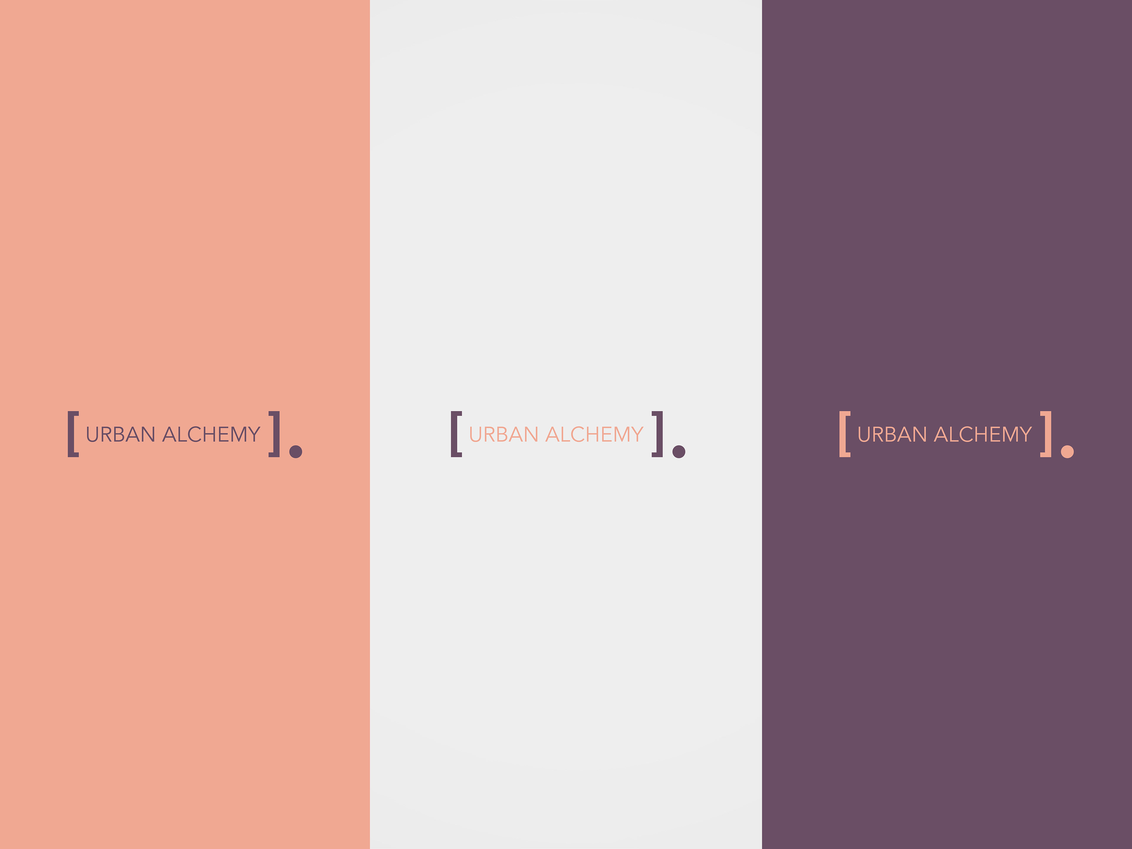
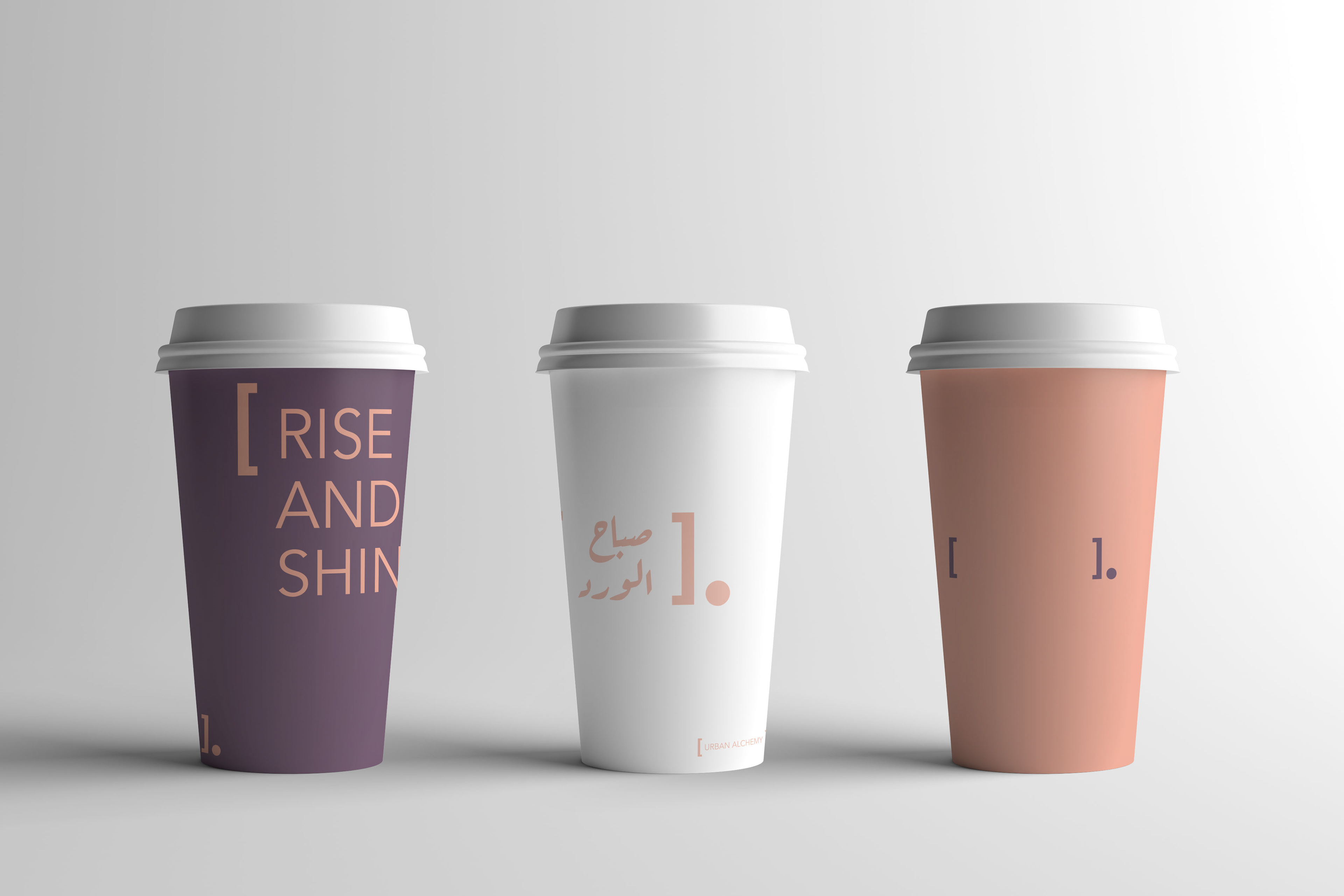
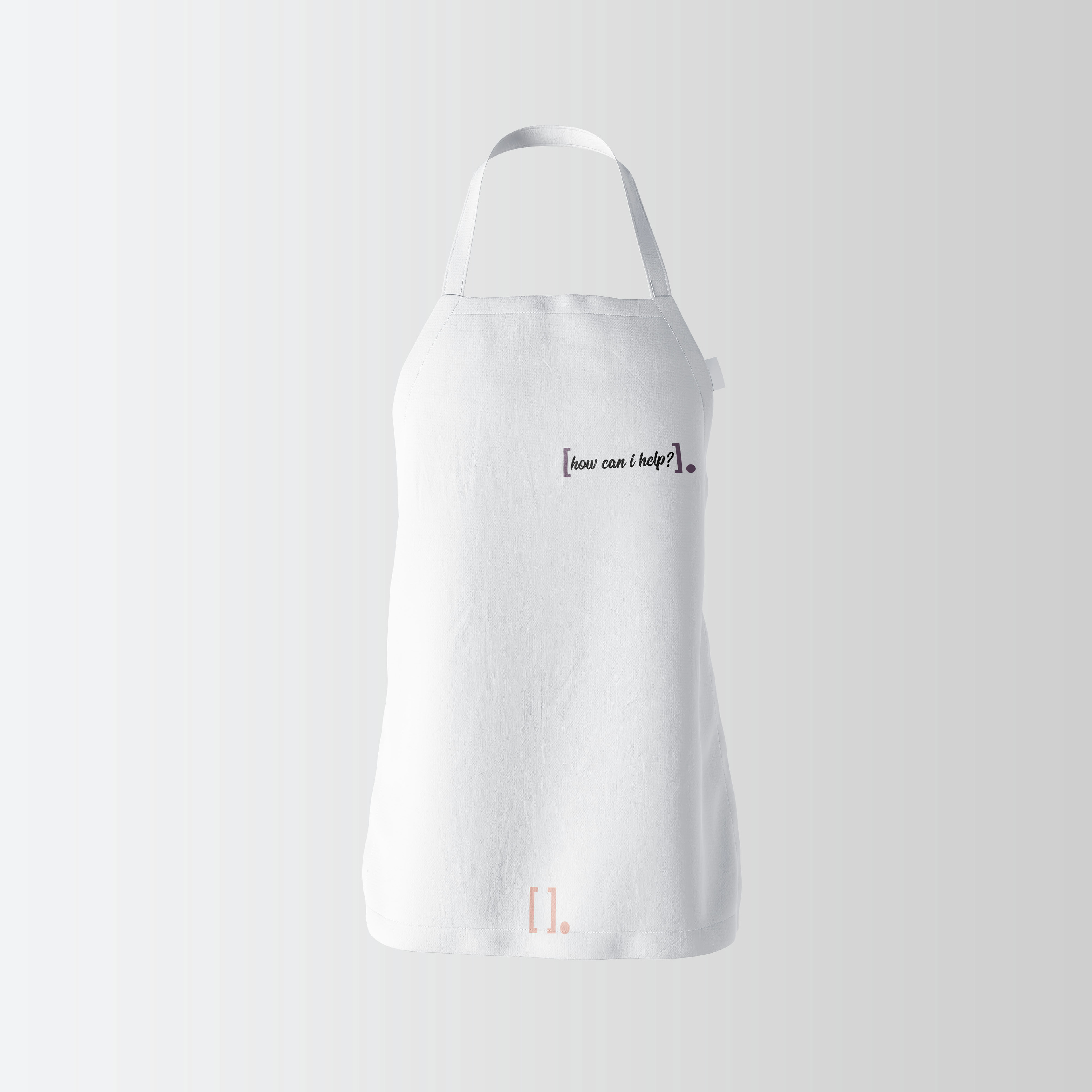
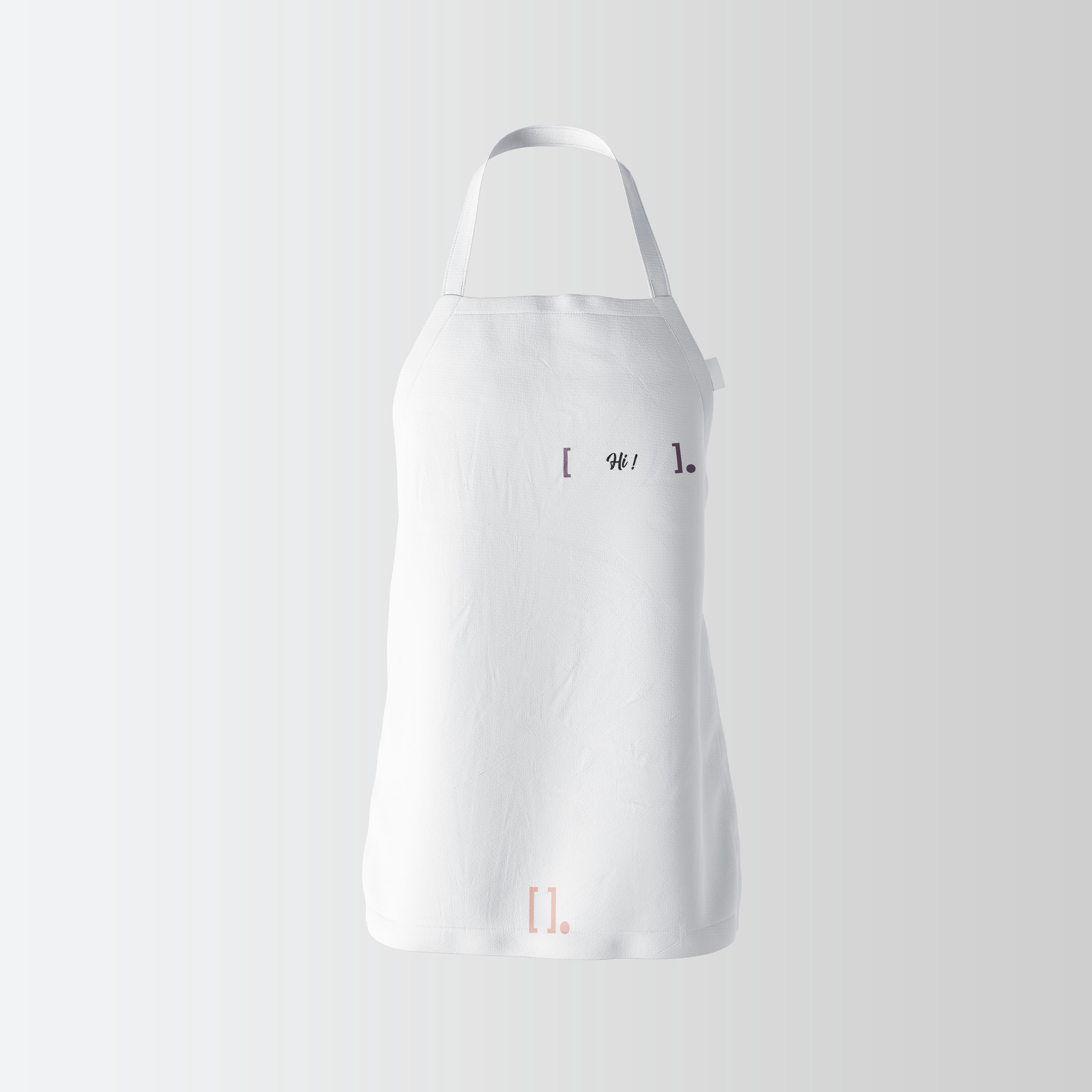
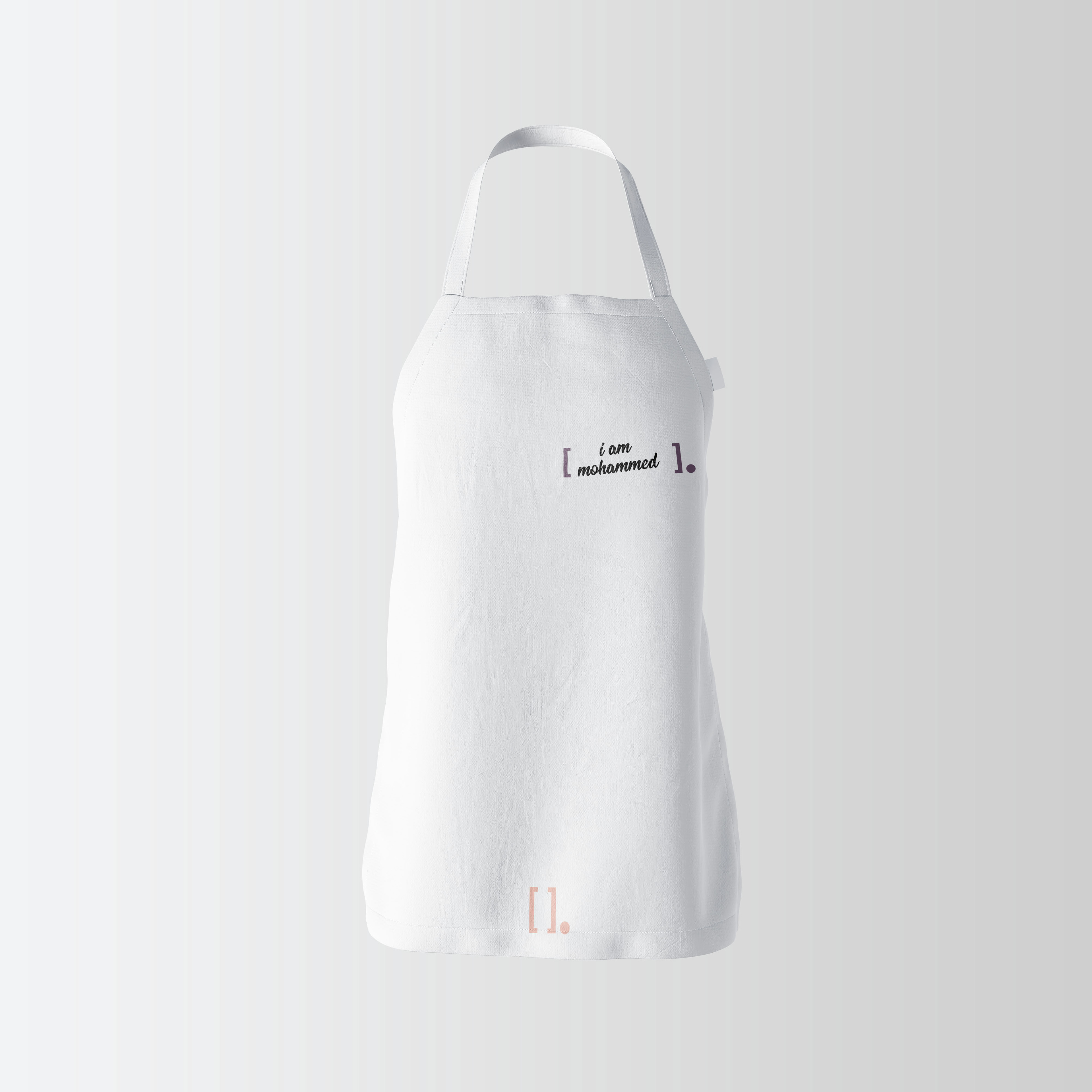
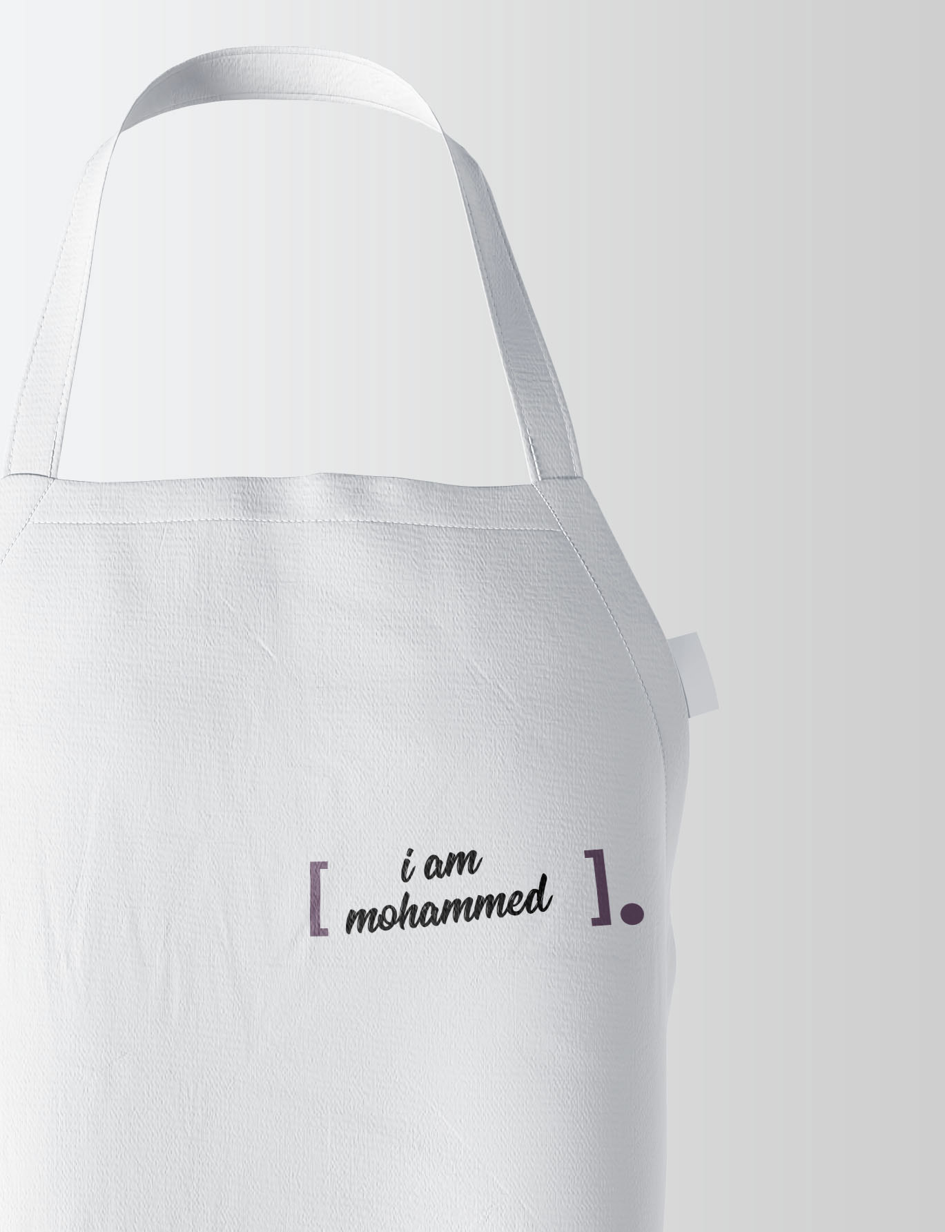
Capitalizing on the modern approach yet the authentic taste, Urban Alchemy manifests the following “We are not reinventing the wheel of what Saudi breakfast is or should be, we will not promise you something unconventional, however, we promise you a quality of taste and experience that will keep you coming back”. As straight forward, the brand logo and identity system is built around the brackets to communicate Urban Alchemy’s simple approach and modern definition, which is the bottom line to a fulfilling experience.
The brand identity is built around the logo, which is the name between brackets followed by a full stop to emphasize the bottom line concept. Also, it is built around the copy which defines the brand voice. As for now, the copy is varied between a straight forward approach and a chemical terminology-inspired copy. The color chosen are dark purple and light orange. When choosing the colors, I wanted to convey the lightness and freshness of the concept of mornings, breakfasts, and coffee shops, keeping both colors in a soft shade.